

Take Industrial Monitoring one step further with Grafana
July 1, 2024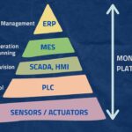
Differences and alternatives to MES, ERP, SCADA
September 10, 2024
tips for creating the perfect dashboard with industrial Grafana
In today’s competitive industrial world, where productivity optimization and continuous improvement are already a necessity, it is imperative that we all have visibility of the data that is relevant to us. In this way, a good industrial dashboard will enable us to make informed decisions quickly and effectively.
We know that by simply providing visibility to plant operators, without any other changes to processes and ways of working, the following improvements can be achieved:
- +25% in operator efficiency: by bringing data closer to them (with dashboards, real time information, automatic reports…)
- +15% in OEE improvement: by improving reactivity (thanks to fast problem detection, customized notifications and automatic alarms…)
- -40% in report generation time: by not having to do it by hand (avoiding human errors, simplifying tasks such as correlations, historical consultation…)

If you wish to know more about the importance of data visibility, we recommend our blog The Importance of Data Visibility in Your Factory
Once we are clear about the need for data visualization, a natural question that arises is… How can I then create the best dashboard?
Read on, and we will give you the keys to succeed with your dashboards 👌.
The Need for an Effective Dashboard Design 📊
Creating an effective dashboard is not just a matter of aesthetics, as it is a critical tool for our business. A well-designed dashboard is the end result of a comprehensive business intelligence process that includes gathering requirements, defining KPIs and creating a data model.
Poor design can cause your industrial dashboard to fail to convey valuable information, even making data less understandable than it originally was.
Therefore, we must never forget the keys to designing a good dashboard:
- It must simplify the complex: The first key to dashboards is that they are able to transform the complexity of large volumes of data and different analytical needs into something simple and manageable. A dashboard must be simple to understand and use, even for tech-savvy users.
- Tell a clear story: It should connect the data to its context and answer the user’s questions, using an appropriate visual presentation, as this will play a crucial role. A good design is one that uses clear, concise language and logical, easy-to-understand navigation.
- Express the meaning of the data: We need to choose data visualizations that correctly represent the information we want to extract, selecting the type of graph that best suits the data we wish to display.
- Reveal details as needed: A dashboard should allow each user to access the data they need, no more and no less. Some may require a more detailed view, while others may need only a summary.
Industrial Dashboard Design Principles ✍️
Since dashboards rely on data visualization, a good dashboard design is one that maximizes visual representation while optimizing content.
Although each industry dashboard has its own requirements and objectives, there are certain guidelines that should be followed for dashboards to be effective:
1. Use Visual Hierarchies
A visual hierarchy is a pattern in which some elements stand out more than others according to their hierarchy. By organizing dashboards according to a visual hierarchy, it is possible to guide the user’s eye to the most relevant information.
It is convenient that the most significant elements are placed at the top of the dashboard, trends in the middle and details at the bottom. To do this properly, don’t forget to organize the data logically so that it makes sense to the end user, and give them options to drill down into the information if they need to.
This arrangement allows us to be more effective in telling the story of our data.
In addition, we must take into account aspects such as size (larger objects are perceived as more important), shape (shapes that stand out from the background attract attention), colour (bright colours that stand out from the rest will attract attention) and the alignment of elements in a logical way (we tend to see the elements in the top left first).
2. The power of spaces
White or negative space is the empty space around the elements of our dashboard. Used well, it will create a sense of balance and hierarchy, and help our design look clean, organized and easy to read.
White space also allows us to draw attention to important information, separate different sections of the dashboard, highlight important data, and create fluidity in the visualization.
3. Choose colours wisely
The use of colour is fundamental in dashboards. It is important to be consistent and not use too many different colours, so we recommend using two or three colours and playing with gradients.
A common mistake is to use very saturated colours too often. It is true that intense colours attract attention, but if you overuse them, users will not know what to look at first and may feel overwhelmed and lost.
On the other hand, using the same colour in the matching elements of all dashboards, we will minimise the user’s mental effort and will make those dashboards easier to understand.
To display the elements in a sequence or a group, it is advisable to use the same colour in all of them, graduating the saturation to simplify their identification.
Finally, we should note that certain colours are associated with certain meanings, and going against that convention can be confusing. Red is usually bad/stop and green is good/forward. Using this distinction correctly can help us design our dashboard.
4. The 5-second rule
The dashboard user should be able to see the relevant information in approximately five seconds. This means that if, on the other hand, it takes minutes to scan the information, there must be problems with the design of your industrial dashboard.
5. Embrace minimalism
Limit your dashboard to less than 10 visual elements. Maintaining a minimalist design is important because users should be able to access the information they need easily and quickly.
If you fill your dashboard with too many elements and an excess of information, you will be creating clutter and “noise” that will prevent users from taking advantage of the dashboard to such an extent that they may become confused and frustrated, even abandoning the application.
6. Know the user and his needs
Dashboards should answer a question and/or tell a story through a progression of data from general to specific. In order to do this properly, we must create them with a use case or purpose in mind.
Each dashboard should have its own specific purpose, from facilitating strategic decision-making to monitoring operational efficiency in real time. Because a general manager does not need to see the same data as a maintenance manager or a line operator, for example.
The main types of dashboards used are:
- Strategic: It shows crucial indicators of organizational health and helps executives identify opportunities for the company.
It is not intended to make a complete analysis, but rather to help reflect and encourage detailed analysis independently. They are therefore usually general dashboards and not very complex. - Analytical: They seek to provide detailed trend analysis, so they focus on measuring time-varying data.
They are usually complex and specific, and consider many different variables to align strategic objectives with performance. - Operational: They focus on key performance indicators (KPIs). They vary by industry and user, and monitor business operations in real time.
As they specialize in monitoring functionality and KPIs in real time, they use less complex data than analytical dashboards. - Tactical: Used at middle management levels, they are highly analytical and delve into key areas of the company’s internal processes.
They give a detailed view of weekly trends and metrics, and allow for improved internal communication and the design of medium and long-term strategies in the different departments.
7. Choose your KPIs wisely
Choosing the right KPIs is fundamental in dashboard design. When choosing KPIs, think about what metrics the end user will need.
For example, operations staff will prioritize KPIs that help them maintain consistent operational performance, improve uptime and reduce mean time to repair (MTTR).
For more on the best KPIs for your industrial dashboard, visit our blog on The best KPI for Industry and how to display them in Industrial Grafana.
8. Choose the right visualization
We can use a variety of graphs to make our dashboard more attractive and easier for the user to understand. It is good to use different charts on different types of data to provide a more complete visualization.
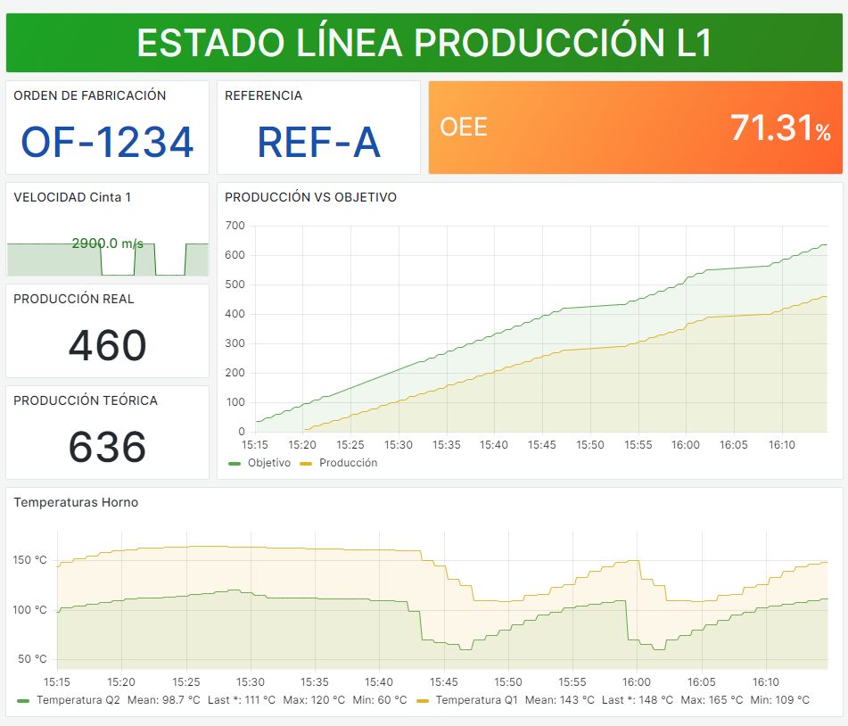
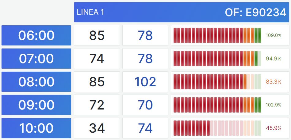
There are multiple options depending on what we want to visualize: needle indicators (single values), line charts (trends and evolutions), tables (all the detail), pie charts, histograms, spider charts, scatter charts, maps…

Always select the right type of visualization for your purpose, whether it’s showing comparisons between metrics, relationships, distributions, compositions…
Also, don’t forget to use consistent and clear labels and descriptions, and avoid including unnecessary functions in your dashboard.
We leave you other visualization options in Grafana’s best plugins for the industry.
9. Be consistent
Consistency is essential when it comes to creating dashboards that are attractive and easy to understand and use. To do this, we must use the same elements in our designs (colours, typography, icons…).
This serves to create a sense of familiarity that will make understanding and navigation more comfortable for the user.
It is advisable to use icons and a colour palette that match well together and are consistent with your brand identity, and use them throughout the design.
10. Don’t forget to iterate
Monitoring and dashboard creation is a journey that requires planning, but it doesn’t end there.
It is important to test your dashboard with real users and get feedback from them, so it will be easier to identify problems and areas for improvement in your industrial dashboard.
In addition, you will need to improve, keep getting feedback from users and constantly iterate to make improvements and adaptations to changes that occur (whether in processes, at the hardware or software level, or even in the company itself).
Even if you think you have created the perfect dashboard for a user, there may still be room for improvement.
11. Think about where it will be displayed
Although it is essential that your dashboard is what is known as responsive, and is able to adjust the content automatically to different screen sizes, when designing it we must try to optimize the display for the main device from which it is going to be used.
So, for example, when designing for mobiles we should not forget the limitations of small screen sizes with a touch interface. Use larger buttons and text, and avoid small details.
What to avoid ✖️
The tendency to want to see everything can cause us to lose sight of what is important. When creating an industrial dashboard, we must be clear about what questions we want to answer, what problems we have and what data we need.
If we make the mistake of wanting to put more information on our dashboard than necessary, we will end up overcomplicating it and it will become a source of confusion rather than a help.
Tip: If you want to go into detail, create specific dashboards for that purpose, but don’t turn your main dashboard into a sea of data, or you run the risk of ending up drowning in it.
Why make our dashboard with Industrial Grafana? 💡
From our experience, we recommend using Grafana as a tool for creating dashboards.
Grafana stands out both for its ease of use and its ability to adapt to the specific needs of each user. It allows us to design visually attractive dashboards capable of capturing the attention and facilitating the quick understanding of the data.
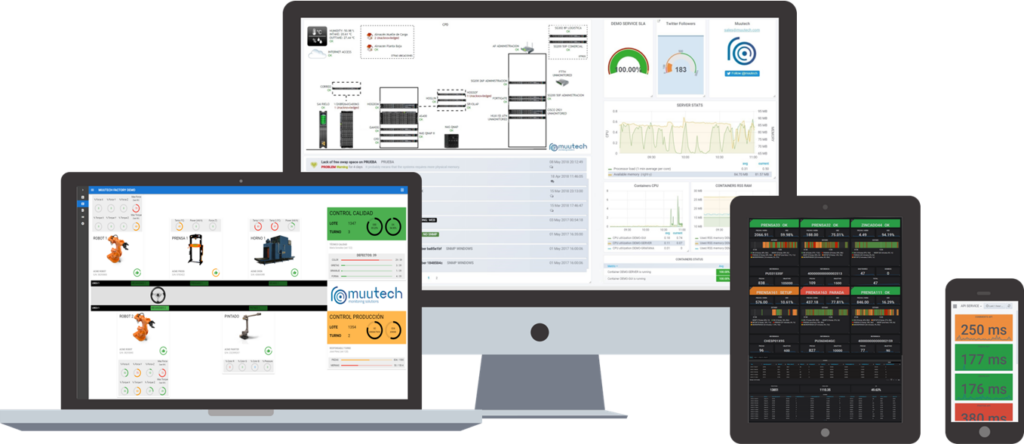
And if you wish to see examples of industrial dashboards designed with Grafana, take a look at our 👇
If you follow all of these tips, you will be well on your way to transforming your data into valuable information that will improve your company’s decision making and operational efficiency.

CTO & TECHNICAL DIRECTOR
Expert in industrial monitoring and data analytics.
We tell you how to improve decision-making and production efficiency in your plant, without wasting time generating reports. Your plant at a glance!
Subscribe to our Newsletter


